Review of Big John Buscema: Comics & Drawings (from the Casal Solleric gallery, IDW Publishing, 2012)
If you are a John Buscema enthusiast, and I am, this looks like an almost irresistible book to buy. The wonderful images of covers, printed pages and the vast amount of original art reproductions make this book impressive. Sadly, there is a lot less here than meets the eye. And I am disappointed.
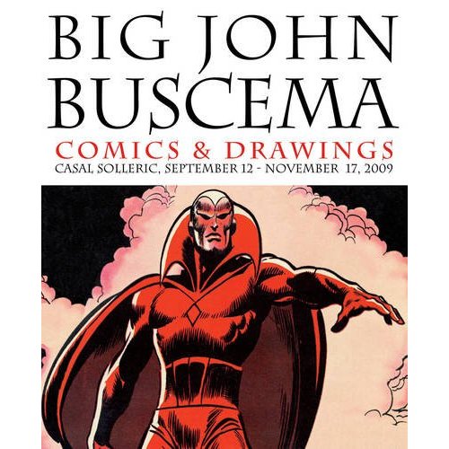
Big John Buscema: Comics & Drawings
I mentioned the artwork, and will get back to that in a bit. But let me bring up three other important points.
The typeset in the book is incredibly small, I would say no bigger than 8 point type, when most books are published in 10 or 12 pt. If you are over 40 or need reading glasses, OR if you are over 50 and use reading glasses, this text will be hard to see. The typesetting is even changed starting on page 185, another distraction. In fact, this is an easy to read book if it wasn’t so hard to read.
And exactly half the text is in another language, Spanish. That’s right, next to every column in English, is another column in Spanish, with (I presume) translated text. For the cover price of $60 (Amazon $32), they should have printed two separate editions, WITH BIGGER TYPE, one in English and one in Spanish. Our Spanish reading amigos will also have trouble with the all English footnotes.
There is no “official writer” credited with authoring this book but Florentino Florez is credited with writing the preface. The book is also written from the perspective of one person, so I assume it is F.F.
So, with so many of the 300 pages filled with pictures, there are, perhaps, 100 pages of text. But we must divide that by 2, one for each language, so there are about 50 pages of text to tell the story of John Buscema. This not a biography but an overview of his work, not his private life. While I did not feel the author was rushed, he was brief.
The book is heavily researched using Alter Ego and The Kirby Collector. For that reason I found little new in the beginning, having read the original interviews when they first appeared. The author relies heavily on the John Romita book. All three are printed by Tomorrow’s Publications. So if you have read those interviews, there is not a whole of new material in the beginning. The rest of the book, perhaps now 40 pages, is more original, but it still relies on those publications.
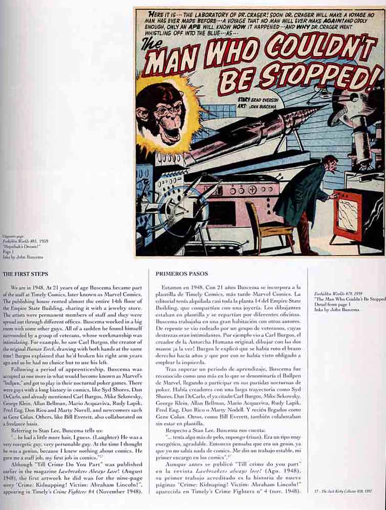
We do start off learning that while working for Martin Goodman in 1950 (Atlas, now known as Marvel) Buscema made $75 a week, but later found work at such places as Hillman and St. John’s for $30-$35 a page. The Comics Code era changed everything and he was down to $21 a page. After drawing Spartacus for Dell in 1960, he would leave the comic book industry for 6 years and go into the advertising industry. When Stan Lee offered him, in 1966, the same salary he made in advertising, but he could work at home, Buscema returned to comics and drew Nick Fury in Strange Tales #150. Solleric takes us through that era, one series at a time, often discussing the inkers who he feels improved or diminished Buscema’s work.
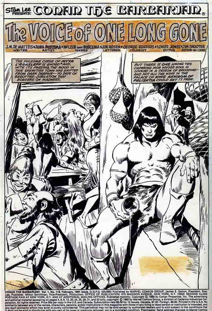
The Avengers segment was interesting and got into his opinions of Buscema’s inkers (the only time Sal is mentioned is as an inker, there is no history between them given), but the content fills up less than a page. Solleric’s two most interesting pieces, for me, were on The Silver Surfer and the prolonged piece on Conan. Since the Avengers and the Surfer were originally Kirby pieces, the writer is careful here. He mentions the influnce Kirby had on comics, and on Buscema, but always mentions how Buscema expanded on and improved on Kirby’s intentions, without every putting him down. He is never so careful with Lee, saying that while Lee handled simple projects well he was not very successful with complex projects. He blames Lee for the failure of the Silver Surfer; saying Lee took the character too seriously and had a formalistic approach.
Buscema had assumed Kirby’s legacy and he had taken it to the next level. He took the explosions, the distorted gestures and the spectacular planning and adapted them into a realistic, solid style, full of energy and elegance. It enabled him to create panels like the one where the Surfer, as a new St. Francis of Assisi, rests amongst a horde of extraordinary beasts. Or those pages where he reaches Asgard and stands up to Thor, when his friends leap over the table to defend him, all of it a marvel of expressiveness. Lee tried to, but he never succeeded. He would claim that his scripts took him in another direction, but he couldn’t do it. In short: Lee had been overtaken by Buscema, and he knew it.
I consider Stan Lee’s legacy no more important than some advocate. His mistake is not in his artistic goals, but rather in the way he tried to be something he wasn’t. He was very good at uncomplicated adventures, but was out of his depth in more complex ones. The Silver Surfer is a noble effort that achieves great results in the field of drawing, but ends up failing in the storyline. This might have brought about the frustration felt by the publisher and the scriptwriter, which could in turn explain his clash with Buscema. It may not be true, but it sounds good…
The illustrations in the book are outstanding. The selections are wonderful. In some ways it feels like the new Artist Editions that are out there, with so much original art although there are no complete stories. There are many illustrations of printed, full color pages that are just great to see. And lots of covers. You really get to see how inkers added or took away from his art. I enjoyed seeing the original art of an unpublished Surfer cover next to the published one. Tarzan, The Avengers, Conan, his Dell work are so well represented here.

The book also has a very nicely researched and laid out Buscema checklist at the back
It’s a hard book to rate. The pictures are an “A+”
The layout and format of the book is a “D”, it’s hard to read and half is wasted in another language.
The text content is good, but there is not enough depth or originality. “C?”
I guess that all averages out to a “B.” But check to see if you can read it first.
(Since writing this, I have learned that the book is a reprint of an exhibition catalog that was originally in THREE languages: Catalonian, Spanish, and English being the third. A lot of rework was done to maintain the page count that was a limiting factor and most of the illustration choices were based on the art that appeared at an exhibition on Majorca in the Mediterranean.)